Speaking Clearly with Typography: A Non-Designer's Guide #3
In Part 1, we created a clean canvas. In Part 2, we learned how to arrange our message with hierarchy. Now, we need to give that message its voice through typography—the fonts you choose and how you compose them.
If you’ve ever scrolled through an endless font menu, clicking randomly to find something that “looks right,” this guide is for you. We’ll replace that random process with an intentional one to help you create text that is clear, compelling, and professional.
Step 1: Understanding the Language (The Basics of Type)
Before we can choose fonts, we need a basic vocabulary. Understanding these few terms will make every other decision easier.
Styles
Within a font family, you have different styles that create emphasis, such as Regular, Italic, and Bold. Some fonts will have even more variations (called weights) such as thin, extra-light, light, regular, medium, semi-bold, bold, extra-bold, and black.

Categories
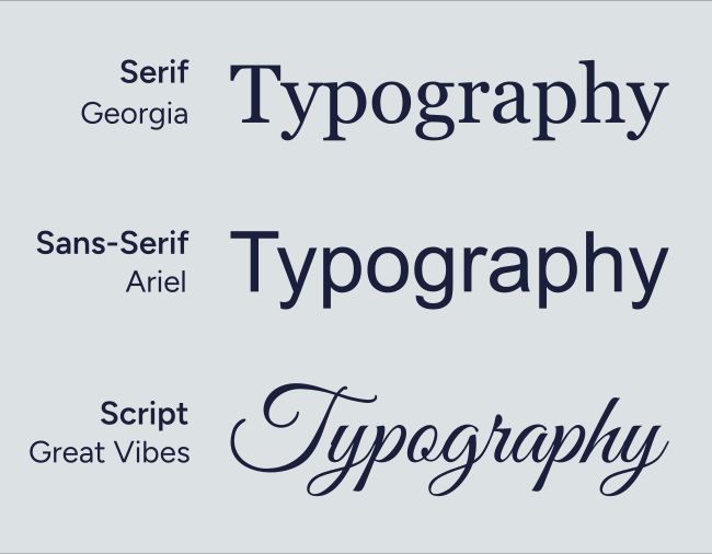
Almost all fonts fall into three main families, each with its own distinct personality:
Serif Fonts: These fonts have small “feet” (serifs) on the ends of their letters. They feel traditional, classic, and authoritative.
- Common Uses: Books, newspapers, formal invitations.
- Examples: Georgia, Cambria, Times New Roman.
Sans-Serif Fonts: “Sans” means “without,” so these fonts have no feet. They feel modern, clean, and friendly. They are heavily used in digital design.
- Common Uses: Websites, mobile apps, modern branding.
- Examples: Helvetica, Calibri, Arial, Futura.
Script & Display Fonts: This is a broad category for anything decorative, from elegant scripts to bold, artistic styles. They are packed with personality but are often hard to read in long sentences.
- Common Uses: A single, impactful word on a wedding invitation or event poster.
- Use them like seasoning, not the main course.
Step 2: Choosing Your Fonts (Matching Mood & Message)
The most important step in moving beyond random font-picking is to understand a simple truth: Fonts have personalities.
You can think of it like a dress code. You wouldn’t wear a tuxedo to a backyard BBQ, and you wouldn’t wear shorts to a formal wedding. The clothes you choose set a tone. Fonts do the same thing for your message. Choosing the right font is about matching its personality to the mood of your event or announcement.
Start with Your Body Text First
Before you worry about a fancy headline, get your foundation right. The overall quality of your design is determined by how your body text looks, simply because there’s more of it. If your main paragraphs are unreadable, the design fails.
Choose a body font whose only job is to be clear and readable. A simple sans-serif like Calibri, Arial, or the free font Lato is a perfect choice.
For designs with large blocks of text like a brochure or book, a highly readable serif font like Georgia, Cambria, Garamond, Palatino, or the free font Lora can also work well. Once you’ve established this clear foundation, you can then choose a more expressive headline font to pair with it.
Matching Your Headline to the Mood
Ask yourself this one question: “What is the one-word feeling of this message?” (e.g., Somber, Joyful, Modern, Formal, Fun). Then, find a font that matches that feeling.
- For a Traditional & Reverent mood like a Christmas Eve service or a sermon series on Romans, a classic Serif font is a great choice. The serifs (or “feet”) give them a sense of history and authority.
Try: Georgia, Cambria, Palatino, Garamond, Lora, Merriweather. - For a Modern & Friendly mood like a Fall Festival, a youth group event, or general announcements, a clean Sans-Serif font is your best bet. They feel current, clean, and approachable.
Try: Calibri Bold, Gill Sans, or the free fonts Montserrat, Jost, Cooper Hewitt. - For an Elegant & Special mood like a Women’s Christmas Tea or a wedding announcement, you might be tempted to use a Script font. Use them like seasoning, not the main course. A script font can work for one or two key words, but all other text must be in a simple, readable font.
Try: The free fonts Great Vibes or Allura for a decorative word, paired with a simple, elegant font like Raleway.

How to Avoid a Mood Mismatch
The reason some fonts feel “bad” is because their personality is either inappropriate for the message or has become a cliché. This is where we can be intentional.
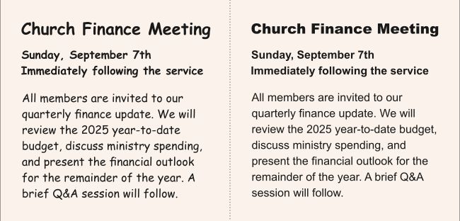
- The “Informal” Mismatch (e.g., Comic Sans): The personality of Comic Sans is playful, informal, and childlike. It was designed for comic book bubbles. When it’s used for a serious church announcement, like a finance meeting or a somber prayer night, the mood clashes. It feels unprofessional not because the font itself is evil, but because its personality is wrong for the job.
- The “Inauthentic” Mismatch (e.g., Papyrus): Many church designs use Papyrus to create an “ancient” or “biblical” feel. However, because it has been overused for decades it no longer feels authentic. Instead, it feels generic and dated. For a timeless, classic feel, a Roman-feeling serif font like Cinzel or even Georgia is a much better choice.
- The “Novelty” Trap: Novelty fonts have extreme personalities (like spooky Halloween fonts or futuristic robot fonts). They are so loud and distracting that they have almost no place in professional design. Their personality completely overpowers your message. Unless you are an experienced designer with a very specific, ironic purpose, it’s best to leave these alone.
Step 3: Composing Your Text (Layout & Spacing)
How your text is arranged is just as important as the font you choose. Good composition makes your message inviting and easy to read.
- Point Size: For print (bulletins), body text should be at least 10-12 pt. For screens (slides), start at 24 pt and go up.
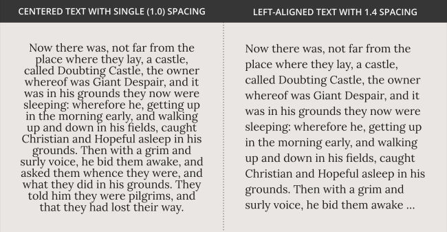
- Line Spacing: This is the easiest upgrade you can make. In your software, change the line spacing from “Single” (1.0) to 1.25 or 1.4. This gives your text breathing room and instantly improves readability.
- Line Length: Avoid text that stretches all the way across the page. Use columns or wider margins to keep lines at a comfortable reading length (around 45-90 characters).
- Alignment: Always left-align paragraphs of text. Reserve center alignment for short, single-line headlines.
A Gallery of Sample Pairings & Examples
Let’s see these principles in action. Here are several examples of font pairings on typical church graphics. Each one is designed to create a specific mood.
1. Modern and Clean
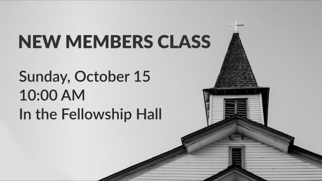
Headline: Lato Heavy | Body: Lato Semibold
Why it Works: Using one font family is a simple, can’t-fail strategy. The hierarchy is created purely through a change in size and weight (Heavy vs. Semibold or Bold vs. Regular). It’s modern, professional, and impossible to misread, making it perfect for straightforward informational graphics. Lato works well for this but you could also use Helvetica, Ariel, Open Sans, Calibri, Gill Sans, or almost any other sans-serif font that has a bolder and lighter variation.
2. Trustworthy and Serious
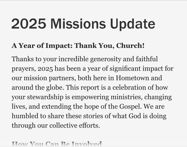
Headline: Franklin Gothic Medium | Body: Georgia
Why it Works: This is a strong pairing of fonts that come included with Microsoft Windows. This combination give an impression of trustworthiness and clarity. Franklin Gothic is a strong, no-nonsense sans-serif for headlines. Georgia is a highly-respected serif font specifically designed for screen readability, making it comfortable for longer paragraphs of text. This combination feels professional and serious.
3. Classic and Formal
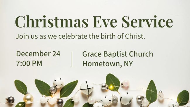
Headline: Playfair Display | Body: Source Sans 3
Why it Works: The Serif/Sans-Serif pairing is a timeless classic. The elegant, high-contrast Playfair Display sets a formal, reverent tone perfect for a traditional service. The clean and highly readable Source Sans 3 delivers the essential details without competing for attention.
4. Strong and Bold
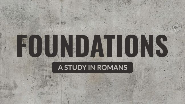
Headline: Oswald | Subheading: Lato
Why it Works: Oswald is a bold, condensed sans-serif font that packs a punch. It’s strong and authoritative without taking up too much horizontal space, perfect for impactful headlines. The more neutral Lato is one of the most readable body fonts available, making it a perfect supporting choice.
5. Fun and Playful
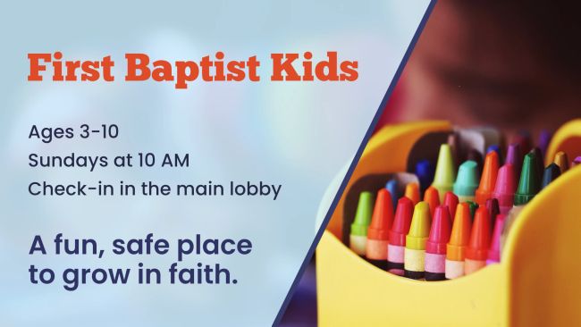
Headline: ChunkFive | Body: Poppins
Why it Works: The fun and personality comes from the ChunkFive font and the colorful photo, while the professionalism comes from the clean alignment and simple, readable body font (Poppins). It feels fun, yet trustworthy and clear.
6. Soft and Elegant
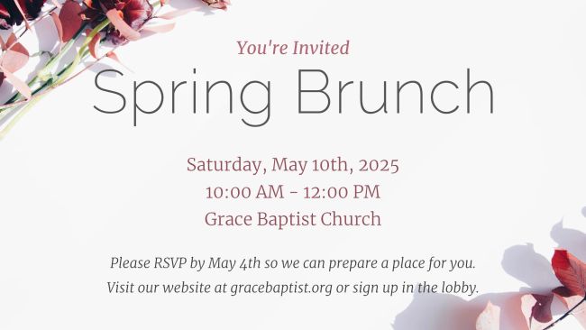
Headline: Raleway | Body: Merriweather
Why it Works: This is an elegant and airy pairing. We use the extralight variant of Raleway for a stylish, feminine feel. Merriweather is a highly readable serif font. Here we use it in a light variant to keep the sophisticated feel we are going for.
7. Friendly and Welcoming
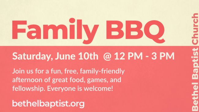
Headline: Montserrat ExtraBold | Body: Lato
Why it Works: The combination of the bold, friendly Montserrat headline and the clear Lato for the body is perfect for an outreach event where approachability is key.
Conclusion: Clarity is Always the Goal
Good typography isn’t about finding the “coolest” font; it’s about making intentional choices to serve your message. By choosing legible fonts, limiting yourself to only a few, and composing them with good spacing, you can create designs that are not only beautiful but also effective.
In Part 4, we’ll bring our designs to life by exploring Color & Contrast.
As always, if you have questions or would like some feedback on your designs, don’t hesitate to reach out.
