Guiding the Eye with Visual Hierarchy: A Non-Designer's Guide #2
In our last article, we learned to create a clean canvas using white space. Now, we need to give that canvas a roadmap. Without one, even a clean design can be confusing, and your most important message gets lost.
That roadmap is called Visual Hierarchy.
Think of it this way: Visual Hierarchy is the art of making the most important thing look the most important. It’s how you tell the viewer’s eye exactly where to look first, second, and third.
The Core Principle: Hierarchy is Created by Contrast
You cannot have hierarchy without contrast. If every element on your graphic looks the same size, the same color, and the same weight, nothing will stand out as the most important. Contrast is what grabs attention and guides the eye.
For non-designers, the good news is you can create strong hierarchy using three primary tools:
Size: Making important things bigger.
Weight & Color: Using bold text and brighter colors for key elements.
Placement: Putting the most important information where people naturally look first.
Let’s take a look at each of these principles.
Tool #1: Contrast in Size (Big vs. Small)
The Rule: Bigger is more important. Our eyes are naturally drawn to the largest element on the page first.
Tip: Decide on the single most important piece of information in your design–usually the event title–and make that text significantly larger than everything else.

See how the change in size instantly tells you what the main message is?
Tool #2: Contrast in Weight & Color (Bold & Bright vs. Thin & Muted)
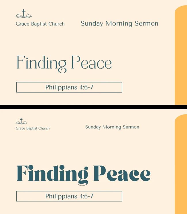
The Rule: Bold and bright comes forward; thin and muted recedes. Our eyes are drawn to strong colors and bold text. These elements feel more important and grab our attention.
Tip: Use your boldest font weight and a bright accent color for your most important element. Use a lighter font weight (Regular, Light) and more neutral colors (like black, white, or gray) for less important supporting information.

Your eyes have a much easier time taking in the second graphic with the bolder title. Think of it like raising your voice or putting a spotlight on what you want people to pay attention to.
Tool #3: Contrast in Placement (What’s at the Top?)
The Rule: What’s at the top gets seen first. We are conditioned to read from top to bottom, and we naturally give more visual weight to elements placed in the upper part of a design.
Tip: Place your most important element—your headline, event title, or key image—in the top half of your design. Don’t bury your lead at the bottom of the graphic.
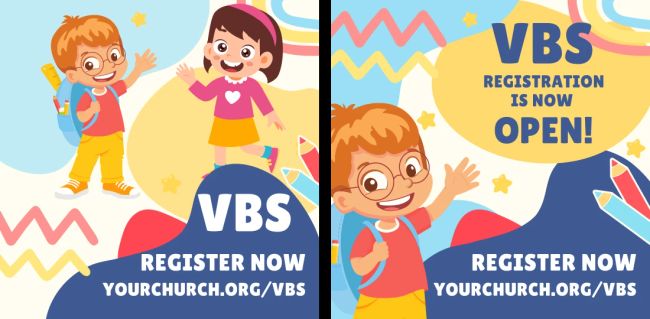
The “Z Pattern”: Most people also tend to scan a page in a “Z” pattern: starting at the top-left, moving across the top, then diagonally down to the bottom-left, and finally across the bottom. Keep this natural eye movement in mind when placing key elements. Putting your main headline in the top-left and a clear call to action (like your website address or a “Register Now” button) along the bottom can be very effective.

By strategically placing your most important information where people naturally look, you ensure it gets seen first.
Conclusion: The Squint Test for Hierarchy
The best designs use Size, Weight & Color, and Placement together to guide the viewer’s eye. Here’s a final, practical tip to check your work:
The “Squint Test”: Step back from your screen and squint your eyes until the text gets blurry.
- What one element still pops out? If it’s your most important piece of information (your headline or key message), your hierarchy is working well.
- Does anything else compete for attention too strongly? If so, you might need to reduce the size, weight, or brightness of those secondary elements.
- Does nothing stand out at all? If everything blurs together, you need to add more contrast in size, color, or weight to your primary message.
Visual hierarchy is a skill that improves with practice. Start by focusing on making your main message stand out, and you’ll be amazed at how much more impactful your designs become.
In Part 3 of our series, we’ll dive deeper into Typography and learn how to choose and use fonts to further enhance your visual hierarchy and set the right tone for your message.
As always, if you have questions or want some feedback on your designs, please don’t hesitate to reach out.
