Understanding Layout and White Space: A Non-Designer's Guide #1
We’ve all seen it. The church event graphic for the summer picnic, packed from edge to edge with text, multiple fonts, and a flurry of clipart. We create these things because we have important information to share, but in our effort to include everything, we often create something that’s cluttered, hard to read, and feels unprofessional.
The single most powerful tool for creating clean, effective graphics isn’t expensive software or artistic talent—it’s learning how to use empty space.
This is the first lesson in our series, A Non-Designer’s Guide to Design. In this article, we’re going to give your message room to breathe.
What is White Space?
White space (or negative space) is simply the empty space in your design. It’s the area between lines of text, between images, and around the margins. For non-designers, our first instinct is to see this as “wasted space” and try to fill it.
This is the single biggest mistake you can make.
Think of white space like an uncluttered room. When a room is clean and has space to move, it feels calm, inviting, and you can easily see everything in it. When a room is cluttered, it feels chaotic and stressful. Your design works the same way. White space is not your enemy; it’s your most powerful tool for creating clarity and focus.
Three Simple Rules for Creating White Space
Okay, so we know we need more empty space, but how do we actually do it? It can feel strange at first. Here are three practical rules to get you started.
1. Create an “Invisible Frame”
The easiest way to make any design look cleaner is to increase the margins. Imagine an invisible picture frame around the inside edge of your graphic and don’t let any important text or images touch it.
Why this works: Giving your content margins prevents a feeling of being cramped and makes the entire design feel more relaxed and professional.
2. Let Your Lines of Text Breathe
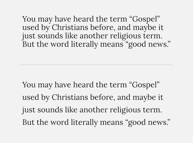
The space between lines of text makes your paragraphs much easier to read. In your software, instead of “Single” line spacing, try 1.25 or 1.4. This small bump makes a huge difference in readability.
Why this works: Increased line spacing reduces eye strain for the reader, making your text more inviting and easier to get through.

3. Make Gaps Obvious
The space between different groups of information should be noticeably larger than the space within the groups.
Why this works: A clear gap signals to the brain to ‘take a mini-pause,’ which helps a person process one chunk of information before moving to the next.
Now, let’s see how white space works with two foundational principles: Proximity and Alignment.
Principle 1: The Power of Proximity
The Rule: Group related items together.
When items are close to each other, our brains automatically assume they are part of the same group. When they are far apart, we see them as separate. You can use this to instantly bring order to your information.
Let’s look at a graphic for a church BBQ.

Now, let’s apply the rule of Proximity. The “When,” “Where,” and “Time” are all logistical details, so they belong together. The “What” is the title and the food, so that can be a separate group.

See the difference? By simply grouping related items, you’ve taken chaos and created two clean, understandable pieces of information. Also notice the space around the outside edge. This “white space” makes the content stand out more easily.
Principle 2: The Order of Alignment
The Rule: Line things up.
Nothing makes a design look more professional than clean alignment. Your eye is calmed by order, and alignment creates that order by giving your text and images invisible lines to connect to. The most common mistake non-designers make is centering every single line of text. While it feels safe, it creates jagged, messy edges that are hard for the eye to follow.
When in doubt, align your text to the left. A strong left edge is one of the easiest ways to make your design look clean and intentional.
Let’s look at a typical sermon graphic.

Now, let’s apply the rule of Alignment.

By lining everything up, you create structure. Your design suddenly looks less like an accident and more like a deliberate, professional composition. The different font sizes also help, but we will learn about that in a future article.
Conclusion: Group it, Align it, and Let it Breathe
These two principles—Proximity and Alignment—are the foundation of mastering white space. When you are creating your next flyer, social media post, or sermon slide, just ask yourself these three questions:
Are my related items grouped together? (Proximity)
Is everything lined up with something else? (Alignment)
Is there enough empty space around my groups and edges? (White Space)
Take a look at one of your church’s recent graphics. How could you apply these rules to make it clearer and more professional? You’ll be amazed at the difference these small changes can make.
In Part 2 of our series, we’ll tackle the next piece of the puzzle: Hierarchy, and how to make the most important thing look the most important.
Do you have a design that you would like me to touch up or critique? Get in touch and I would be happy to look at it.
